
Latest News
Swiggy Instamart Celebrates Ganesh Chaturthi with Free Modak Dispenser in Mumbai
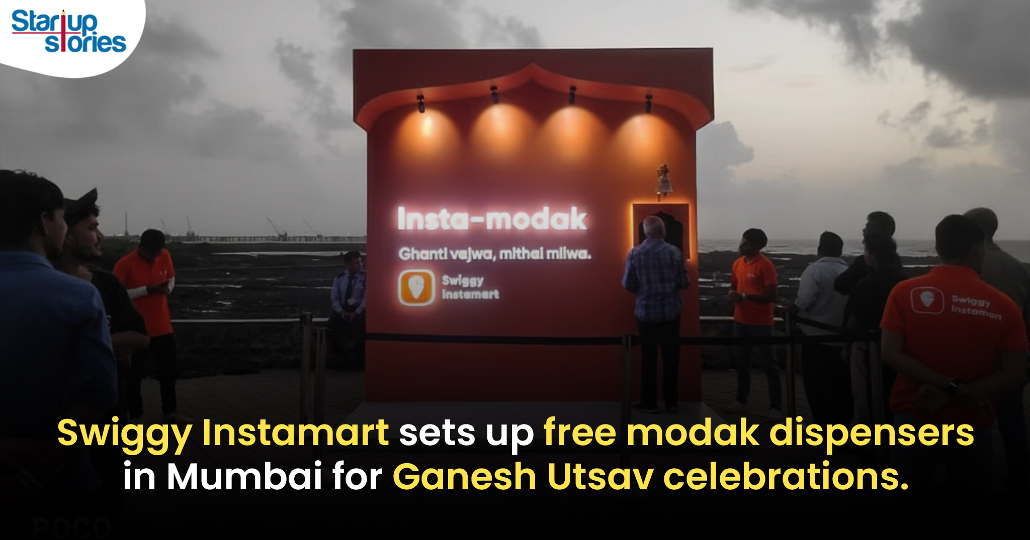
As Mumbai geared up for the grand celebration of Ganesh Chaturthi, Swiggy Instamart installed a unique modak dispenser on Carter Road to mark the auspicious occasion. The dispenser, operational on September 6th and 7th, offered 1,000 free modaks daily to passersby, dispensing approximately 142 modaks per hour.
The modak dispenser, designed to attract attention, featured an audio sensor that was triggered when a bell was rung. Within five seconds of activation, the dispenser released a single hygienically packed modak in a box. Each box contained a QR code that directed users to Swiggy Instamart’s dedicated Ganesh Chaturthi section on their platform.
Swiggy Instamart’s Ganesh Chaturthi Section
The Ganesh Chaturthi section on Swiggy Instamart offered a wide range of pooja essentials, modak-making kits, assorted modak flavors, and eco-friendly Ganesha idols. Customers could access these items through Swiggy Instamart’s quick delivery service, with items being delivered within 10 minutes.
Collaboration and Social Media Impact
The initiative, a collaboration between Swiggy, Havas Media, and Havas Media Tribes, gained significant attention on social media. The dispenser featured the Marathi phrase ‘Ghanti Vajwa, Mithai Milwa’ (ring the bell, get the sweet), adding a touch of traditional charm to the modern technology.
Swiggy Instamart’s modak dispenser not only celebrated the cultural significance of Ganesh Chaturthi but also served as a strategic promotion for their festive offerings. The initiative exemplified how brands can effectively connect with local traditions and enhance customer experience through innovative approaches.


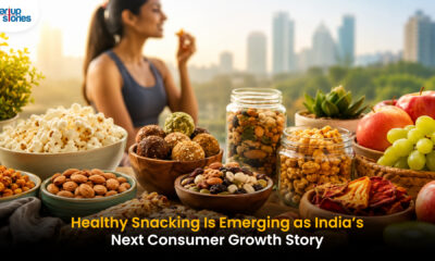


The healthy snacking category in India is no longer a niche trend it is steadily becoming a mainstream consumer movement. The latest funding momentum around brands like Phab highlights how investors are increasingly backing companies that sit at the intersection of health, convenience, and modern lifestyles. As urban consumers become more conscious of ingredients, nutrition, and long-term wellness, demand is shifting away from traditional packaged snacks toward products that promise both taste and better nutritional value.
What makes this market particularly attractive is its ability to create recurring consumer habits. Unlike many direct-to-consumer categories that rely heavily on one-time purchases, healthy snacks naturally fit into daily routines. This opens opportunities for brands to build stronger customer loyalty while expanding into adjacent categories such as protein-rich foods, functional beverages, and wellness-focused products. The competition is no longer about selling snacks it is about owning a larger share of the consumer’s health journey.
Looking ahead, the biggest winners may not be the brands with the widest product portfolios, but those that can balance nutrition, affordability, and taste at scale. As health-conscious consumption expands beyond metro cities, India’s better-for-you food segment could evolve into one of the country’s most significant consumer categories. The growing flow of capital into this space signals that investors are betting on a long-term behavioral shift rather than a short-lived food trend.
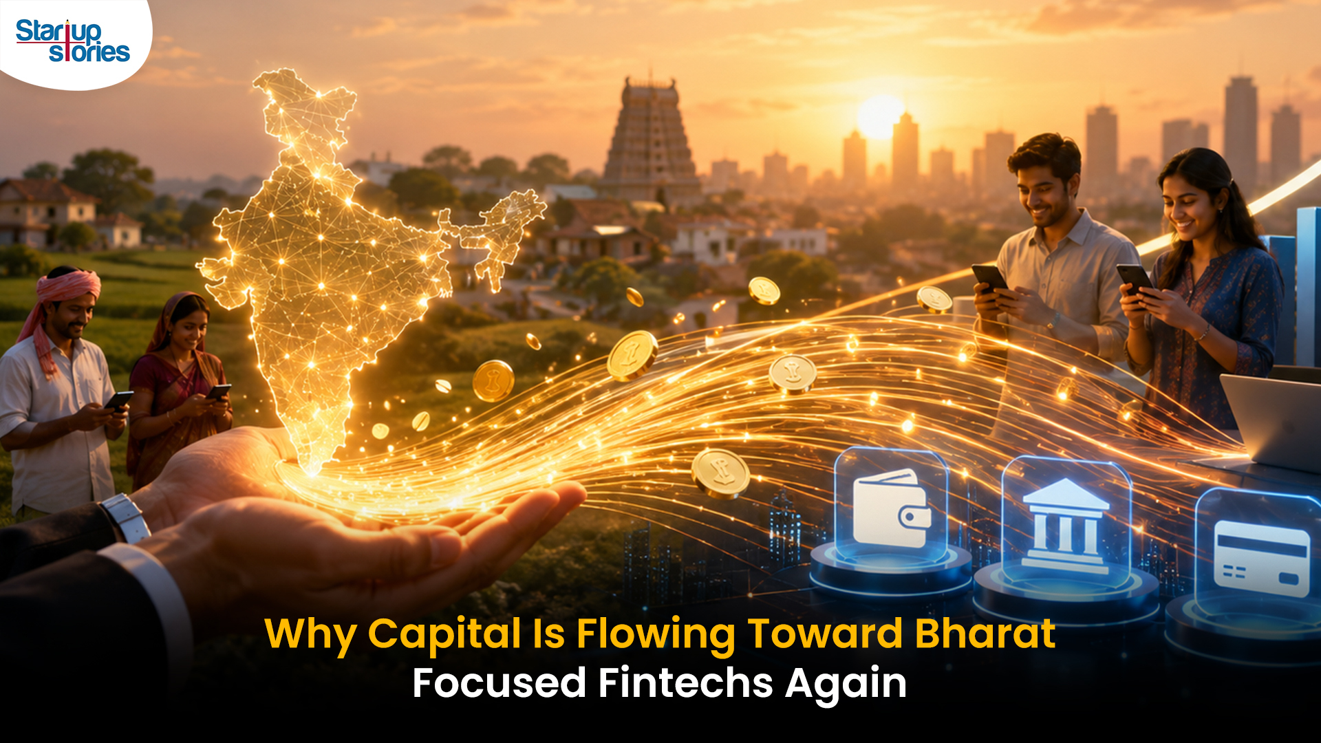
India’s fintech sector is entering a new phase of growth, and the spotlight is increasingly shifting toward underserved consumers in smaller cities and towns. The recent funding secured by WeRize reflects growing investor confidence in platforms that are expanding access to financial products such as credit, insurance, and other services for customers who have traditionally remained outside the reach of formal financial institutions. As digital adoption deepens across the country, fintech companies are finding significant opportunities beyond metro markets.
What makes this trend notable is the industry’s transition from simply enabling digital payments to building broader financial ecosystems. Rather than focusing on a single service, fintech firms are expanding their product portfolios to meet multiple customer needs under one platform. This approach not only strengthens customer relationships but also creates more sustainable business models by increasing engagement and lifetime value.
The larger implication is that India’s next fintech growth story may be driven by financial inclusion rather than convenience alone. Investors are increasingly backing companies that combine technology, data-driven underwriting, and localized distribution to serve emerging consumer segments. As competition intensifies, the ability to build trust, offer relevant products, and address the financial needs of Bharat could become a key differentiator for the next generation of fintech leaders.

OpenAI’s introduction of trusted contact safeguards for potential self-harm cases reflects a major evolution in AI responsibility.
Beyond Moderation
AI safety is shifting from simply blocking harmful content to actively supporting user wellbeing through:
- early risk detection
- human-centered intervention
- stronger emotional safety frameworks
This positions AI as more than an information tool—it becomes part of broader digital support systems.
Key Industry Impact
Trusted contact models could influence future safety standards across:
- AI assistants
- mental health platforms
- social media
- digital health services
The Bigger Challenge
While promising, success depends on balancing:
- privacy
- consent
- ethical intervention
- user trust
Final Take
This move signals that the future of AI safety may rely not just on preventing harmful responses, but on building more responsible, human-connected support systems.


