
Technology
How Popular Websites Looked Like When They Were Launched
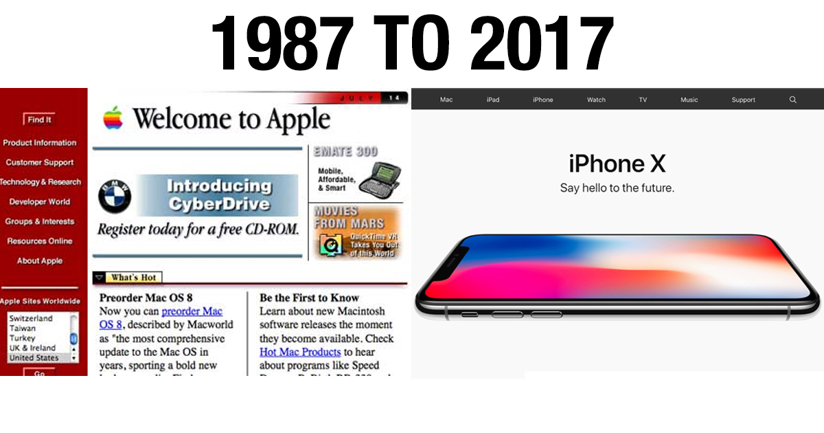
Before social media became synonymous with Facebook or Twitter and before Google became equivalent with research, the popular websites of today were not as advanced. Although the technology was not as advanced as it is today, this is how our beloved websites looked like, way back in the day.
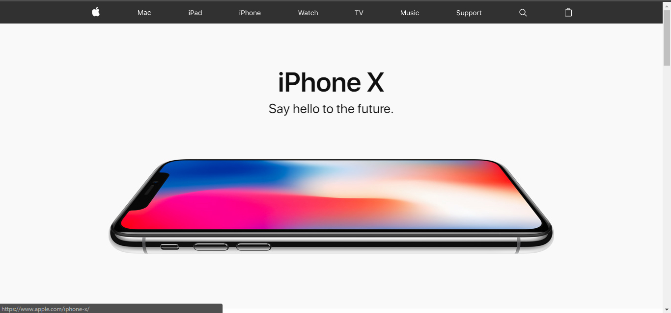
Apple.com
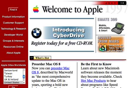
To keep its loyal consumer base updated regarding the upcoming releases and other products, Apple launched their very own website in 1987. However, the look and feel of the website then and now are miles apart.
Yahoo
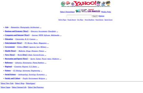
Founded by Stanford duo Jerry Yang and David Filo in 1994, Yahoo is the acronym for “Yet Another Hierarchical Officious Oracle.” Considered to be the first online navigational guide to the web, the original interface featured a simple search bar and hyperlinks to other websites but soon became a sleek, personalized news website.
eBay
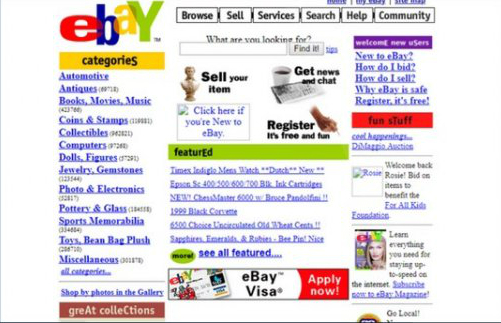
Founded by Pierre Omidyar in 1995, eBay was originally supposed to be called AuctionWeb. Today, the company has an artificial intelligence powered shopping assistant and a market capitalization of $37.48 billion.
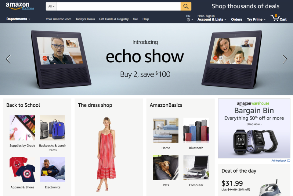
Amazon.com
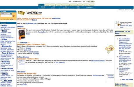
Everyone who knows the story behind Amazon knows the online retail store was first started to sell books. The ecommerce giant of today first took root in 1995, however, the company now offers deals on almost everything.
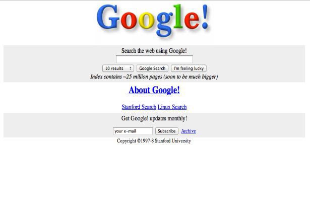
Launched in 1996, Google had a simple interface that it has continued to use to date. Google Founders Larry Page and Sergey Brin kept the user interface simply because they did not know HTML and were looking for a quick design.
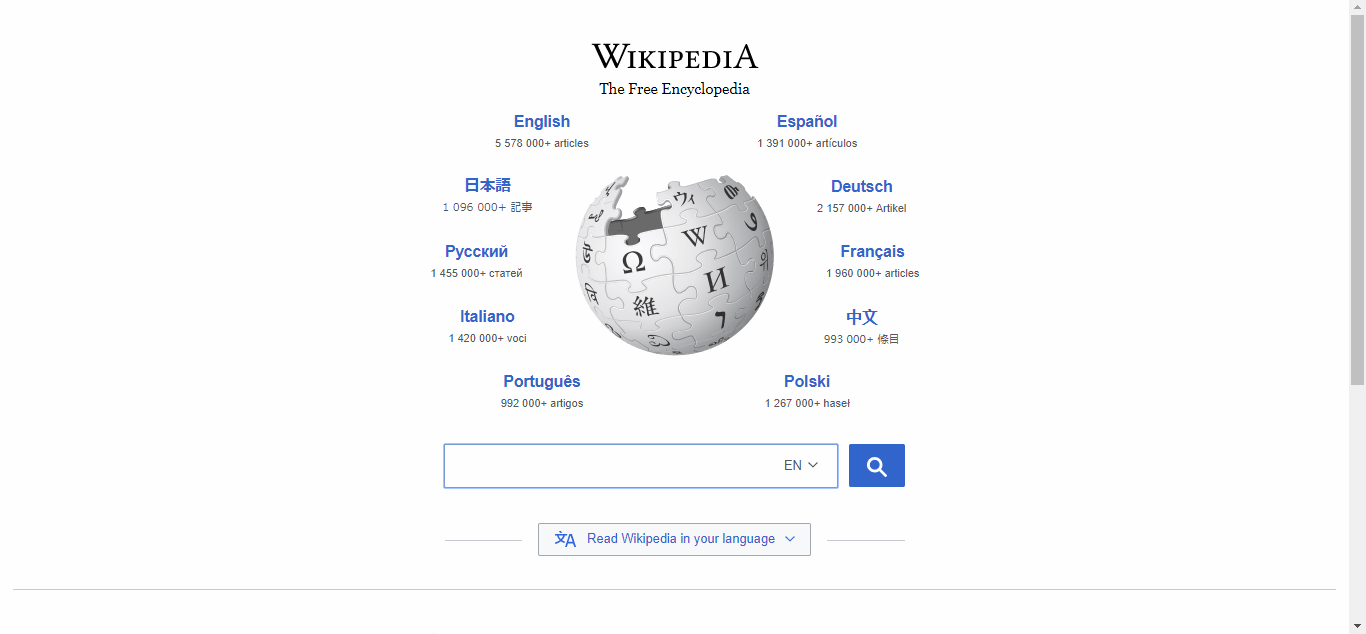
Wikipedia
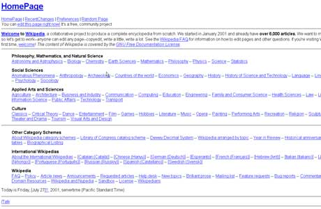
The online encyclopedia was registered by Jimmy Wales and Larry Sanger on 15 January in 2001. Little has changed in the world’s fifth most popular website which receives a monthly readership of 495 million and 18 billion page views per month.
MySpace
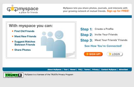
The original social networking site, MySpace had a pretty bland original design. However, the site skyrocketed in terms of popularity between 2005 and 2008 after News Corp., acquired the company.
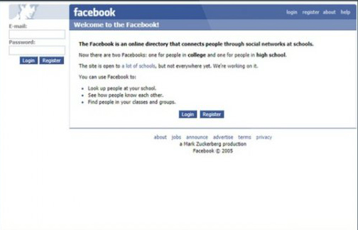
Thefacebook, as it was called in 2004, was only available to Harvard University Students. The original interface featured a man’s face on the upper left hand corner of the site which was a digitally manipulated picture of Al Pacino.
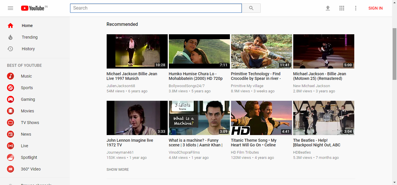
YouTube
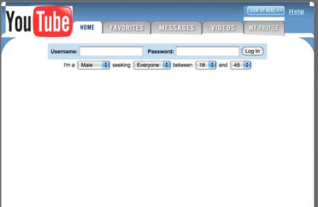
Video sharing website YouTube which shined a light on stars like Justin Bieber and hits like “Charlie bit my finger” was launched in 2005. The overall look, 12 years later still has a similar look and feel had a practically empty interface and no evidence of videos. The first video uploaded on the site was created by one of YouTube’s founders, Jawed Karim, and was titled “Me at the Zoo.”
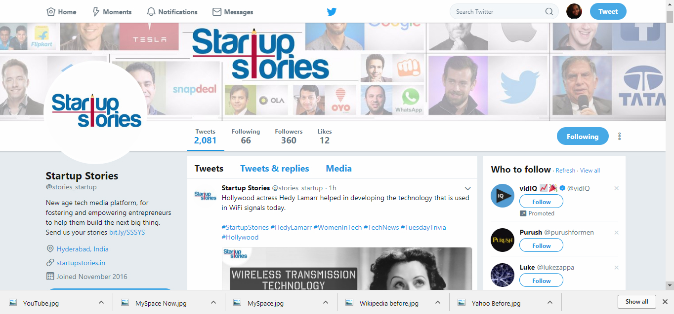
Twitter
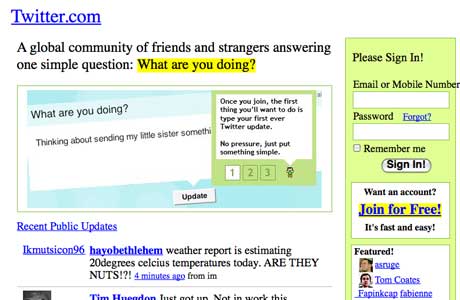
The microblogging social media website, Twitter, which gained popularity for its character limit was supposed to be called Twttr. The website had a barely recognizable design at the beginning and since then has changed their interface design at least six times.


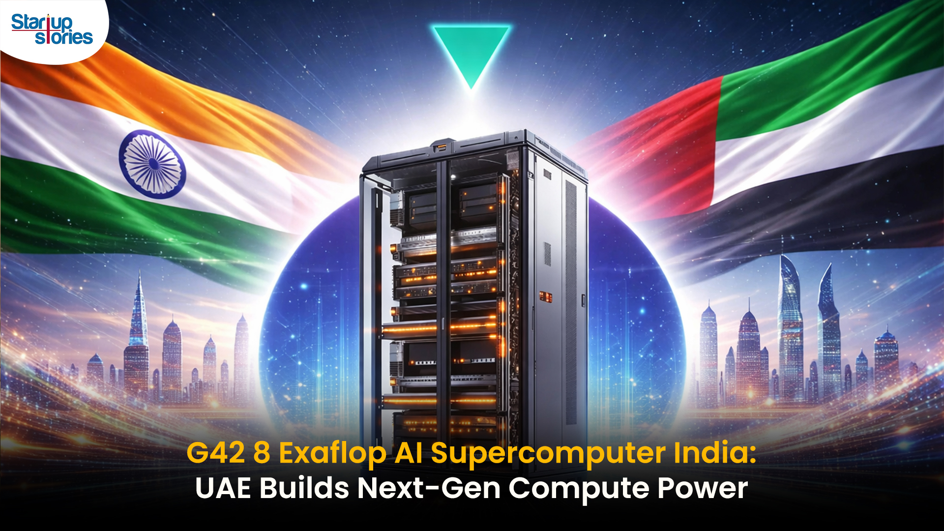
UAE-based G42 has announced plans to deploy an 8 exaflop AI supercomputer in India, announced at the AI Impact Summit 2026 in Delhi. This national-scale project partners with Cerebras, MBZUAI, and India’s C-DAC, operating under full Indian data sovereignty as part of the India AI Mission.
The supercomputer boosts sovereign AI capabilities, enabling startups, researchers, academics, SMEs, and government access for tailored applications like public services and language tech. G42 India CEO Manu Jain highlighted its role in making India AI-native while prioritizing security.
This follows India-UAE tech pacts in late 2025, positioning India among global leaders in exaflop AI infrastructure amid rising demand for localized compute. Cerebras CSO Andy Hock noted it will accelerate large model training for India-specific needs.
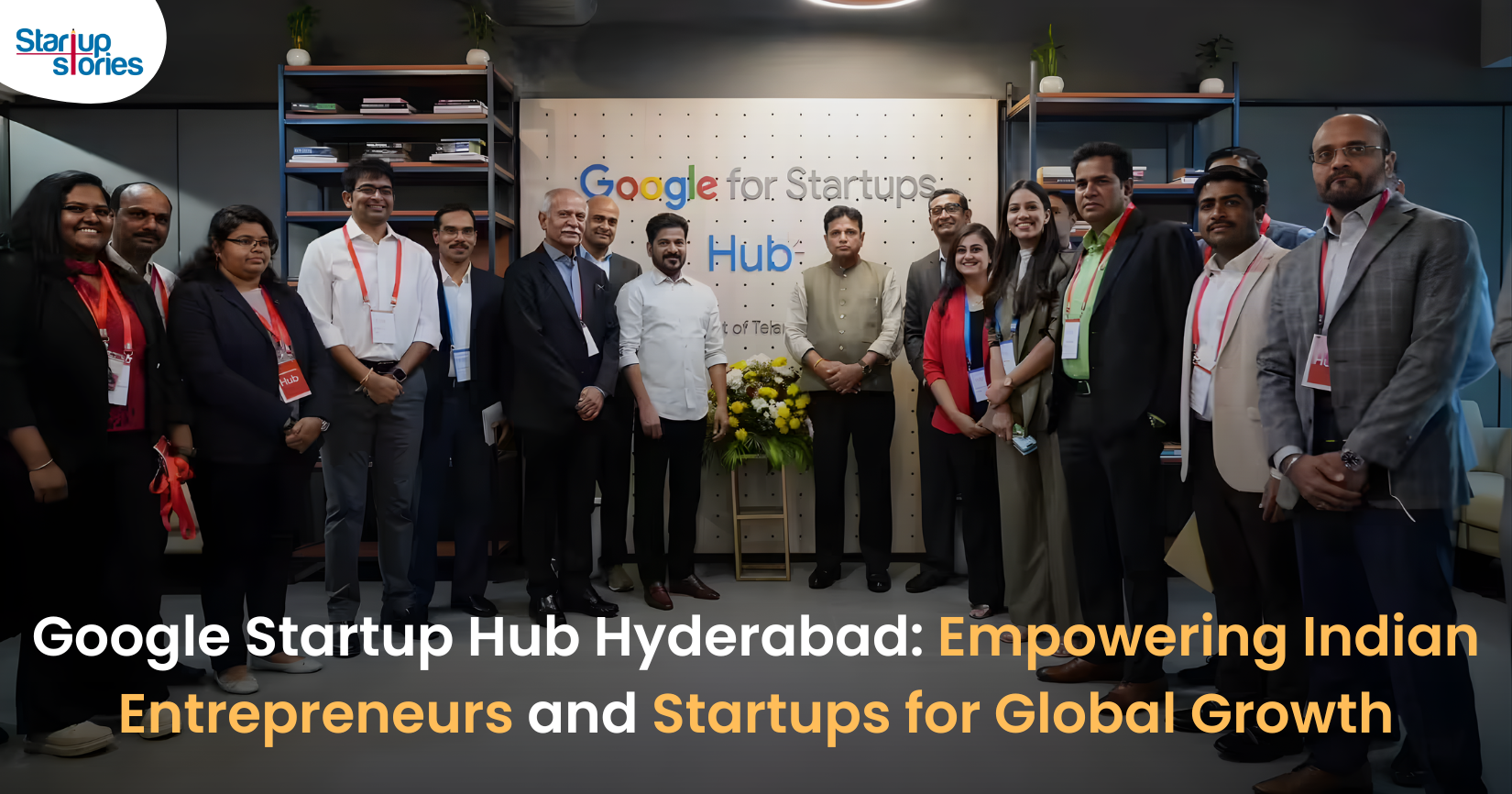
Google has launched the Google Startup Hub Hyderabad, a major step in strengthening India’s dynamic startup ecosystem. This new initiative aims to empower entrepreneurs, innovators, and developers by giving them access to Google’s global expertise, mentoring programs, and advanced cloud technology. The hub reflects Google’s mission to fuel India’s digital transformation and promote innovation through the Google for Startups program.
Located in the heart of one of India’s top tech cities, the Google Startup Hub in Hyderabad will host mentorship sessions, training workshops, and networking events designed for early-stage startups. Founders will receive Google Cloud credits, expert guidance in AI, product development, and business scaling, and opportunities to collaborate with Google’s global mentors and investors. This ecosystem aims to help Indian startups grow faster and compete globally.
With Hyderabad already home to tech giants like Google, Microsoft, and Amazon, the launch of the Google Startup Hub Hyderabad further cements the city’s position as a leading innovation and technology hub in India. Backed by a strong talent pool and robust infrastructure, this hub is set to become a growth engine for next-generation startups, driving innovation from India to global markets.
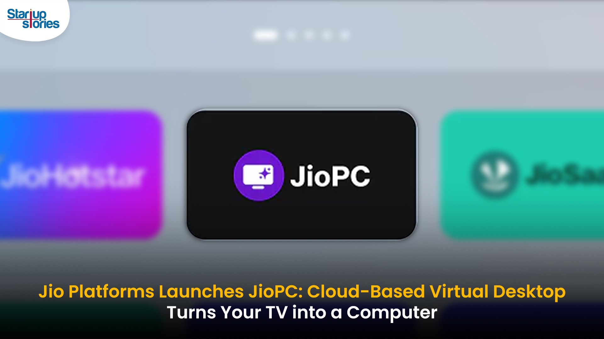
- Jio Platforms has launched JioPC, a cloud-based virtual desktop service that transforms any television connected to a Jio Set Top Box into a fully functional computer.
- Users simply connect a keyboard and mouse to access a desktop-like environment, complete with web browsing, productivity tools, and educational apps—all without needing a physical PC or extra hardware.
- The service is device-agnostic and works with all consumer PC brands, making advanced computing accessible and affordable for millions across India.
JioPC is designed to support a wide range of activities, from professional work to online learning and creative projects. By leveraging Jio’s robust cloud infrastructure, users can run even compute-intensive AI applications directly from their TV screens. The platform also ensures data security and reliability, as all files and settings are safely stored in the cloud, protecting users from data loss even if their device is reset or replaced.
With JioPC, Jio aims to democratize digital access and bring high-performance computing to Indian households at a fraction of the traditional cost. The service supports popular productivity suites like LibreOffice and Microsoft Office online, and Jio is offering a free trial to encourage users to experience the benefits firsthand. This innovative move is set to reshape how people in India work, learn, and connect in the digital age.

What Investor Exits Reveal About the New Age of Indian Startups

Healthy Snacking Is Emerging as India’s Next Consumer Growth Story


Salomon wide shoes
April 24, 2026 at 12:39 am
I appreciate the effort put into this post.
Salomon childrens shoes
April 26, 2026 at 6:27 am
Very practical and actionable tips.
tv live world
May 2, 2026 at 3:23 am
Every sentence here adds value.
Willardteake
May 15, 2026 at 6:42 pm
The CBD collection – cbd pain relief offers a multifariousness of formats that please different preferences, and each undivided feels grandly executed. The lubricate appears blameless and consistent, the packaging materials sensible of durable, and the design is lucid until now elegant. The products are easy to store and fraternize with, thanks to obvious lids and aphoristic sizing. Total, the maker delivers a outstanding and carefully crafted feel without unnecessary extras.