
Latest News
Google’s Iconic ‘G’ Logo Gets First Update in 10 Years
Google has refreshed its iconic ‘G’ logo for the first time in nearly 10 years, replacing the familiar solid blocks of red, yellow, green, and blue with a smooth, vibrant gradient that blends these colors seamlessly. This subtle update gives the logo a softer, more fluid, and modern appearance, aligning with Google’s evolving digital identity and current design trends.
The new gradient transitions smoothly from red to yellow, yellow to green, and green to blue, making the logo more visually appealing and adaptable across various devices, especially on mobile platforms. This redesign also reflects Google’s growing emphasis on artificial intelligence, echoing the gradient style used in the branding of Google Gemini, the company’s AI-generative assistant.
The updated ‘G’ logo has started rolling out on iOS through the Google Search app and on some Android devices, particularly Pixel phones running the Google app beta version 16.18. However, most other platforms, including the web and non-Pixel Android devices, still display the classic solid-color logo. A wider rollout is expected in the coming weeks.
So far, Google’s main wordmark and other product logos like Chrome, Maps, and Gmail remain unchanged. Given the shift toward gradient designs and AI-inspired visuals, similar updates to other Google icons may follow in the future.
In summary, this first major update to the ‘G’ logo since 2015 signals a subtle but meaningful shift in Google’s branding strategy, blending tradition with innovation as the company deepens its focus on AI and modern design aesthetics.


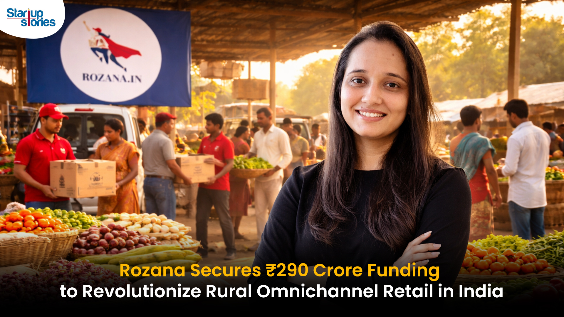
Rozana, India’s leading rural retail platform, has secured ₹290 crore ($35 million) in a Series B funding round led by Bertelsmann India Investments (BII), with participation from Omidyar Network India, Vivid Capital, and Tana Investment Holding. This Rozana funding brings its total capital to over ₹500 crore, fueling hyperlocal expansion in underserved rural markets. Founded in 2021 by brothers Prashant and Prateek Chauhan, the startup’s phygital model blends micro-stores, app-based ordering, and last-mile delivery to connect 5 million+ users in 12 states with brands like ITC and HUL.
The ₹290 crore investment will supercharge Rozana’s rural omnichannel retail strategy, targeting 5x growth in 18 months. Plans include adding 5,000 micro-stores in Uttar Pradesh, Bihar, and Rajasthan; AI-powered inventory tech; and new categories like groceries and electronics. By empowering 20,000+ rural micro-entrepreneurs, Rozana taps into India’s $700 billion rural retail boom, where smartphone penetration and UPI drive 12% annual growth.
This Rozana Series B milestone positions it as a frontrunner against rivals like Ninjacart, eyeing unicorn status by 2028 amid ONDC tailwinds. CEO Prashant Chauhan emphasized, “We’re building rural prosperity through accessible premium brands.” For more on Rozana funding news and rural retail trends, stay updated on India’s startup ecosystem.

Peak XV Partners has launched three new funds totaling $1.3 billion, targeting India’s booming startup ecosystem. The lineup features the $600M Surge fund (8th edition) for early-stage ventures, a $300M Growth Fund for Series B+ scaling, and a $400M Acceleration Fund for rapid portfolio expansion. This commitment arrives as India’s VC inflows rebound, with AI and fintech leading 2026 trends.
These funds build on Peak XV’s legacy of backing unicorns like Zomato and Pine Labs, offering founders capital plus strategic guidance amid post-winter recovery. Early-stage deals surged 20% last year per Tracxn, positioning Peak XV to fuel the next wave of innovation in SaaS, climate tech, and consumer plays.
For startups eyeing Peak XV new funds or Surge fund 2026 applications, this signals prime opportunities. Investors and marketers should watch for deployment updates India remains a global VC hotspot.

Hyderabad, January 13, 2026 Neeman’s, India’s leading D2C footwear brand famed for sustainable shoes and patented PIXLL® technology, has raised $4 million from existing investors. This funding boosts its cumulative capital past $10 million since 2015, with a post-money valuation nearing $50 million. CEO Vijay Chahoria emphasized offline retail as the “next frontier,” planning 50+ new stores in Tier 2/3 cities like Jaipur and Lucknow to blend eco-friendly innovation with hands-on customer experiences.
In India’s booming D2C ecosystem where footwear sales hit ₹1.2 lakh crore in 2025 Neeman’s targets hybrid retail amid high online CAC and 25-30% returns. Backed by vegan, machine-washable shoes priced ₹2,000-4,000, the brand leverages PIXLL® (5x more breathable than leather) for carbon-neutral comfort. Recent 5x revenue growth to ₹100 crore ARR, 1M+ pairs sold via Myntra and stores, and awards at India D2C Summit 2025 position it ahead of rivals like Paaduks.
Neeman’s offline expansion India eyes the $15B sustainable footwear market by 2028, fueled by PLI schemes, Gen Z’s 70% eco-preference (Nielsen), and Southeast Asia exports. Challenges like real estate costs are offset by data-driven inventory and omnichannel QR tech. Watch for Q1 2026 launches in Hyderabad and Bengaluru redefining D2C success through authentic, “Wear the Change” branding.

Apple MacBook Air M5 Launched: M5 Chip, 22-Hour Battery in India

₹290 Crore Boost: Rozana’s Series B Funding Scales Rural Retail Network Nationwide


Lost Mary BM6000 pods
April 11, 2026 at 11:49 pm
I was curious if you ever considered changing the structure of your website? Its very well written; I love what youve got to say. But maybe you could a little more in the way of content so people could connect with it better. Youve got an awful lot of text for only having 1 or two images. Maybe you could space it out better?
JosephInalf
April 12, 2026 at 1:03 am
изготовление флага с логотипом в спб где сделать флаг на заказ
custom mylar bags
April 12, 2026 at 7:58 am
Do you mind if I quote a couple of your posts as long as I provide credit and sources back to your webpage? My blog site is in the exact same area of interest as yours and my users would really benefit from some of the information you provide here. Please let me know if this alright with you. Many thanks!
custom mylar bags
April 12, 2026 at 7:18 pm
Thx for your post. I want to say that the price of car insurance differs from one insurance policy to another, simply because there are so many different issues which play a role in the overall cost. As an example, the model and make of the auto will have a tremendous bearing on the fee. A reliable old family car or truck will have a more affordable premium when compared to a flashy fancy car.
Michaelbah
April 12, 2026 at 8:08 pm
Хочешь оригинальную подушку? заказать подушку дакимакура комфорт и уют для сна. Длинная форма, мягкий наполнитель и стильные принты. Отлично подходит для отдыха и расслабления.
Calvinspits
April 13, 2026 at 3:03 am
Нужен пластический хирург? центр пластической хирургии цены современные операции и эстетические процедуры. Опытные хирурги, безопасные методики и индивидуальный подход. Консультации, диагностика и качественный результат.
BaseSwap analytics
April 13, 2026 at 5:01 am
I personally find that the using the API process is simple and the wide token selection makes it even better. The mobile app makes daily use simple.
Allbridge staking
April 13, 2026 at 6:28 am
This platform exceeded my expectations with easy onboarding and useful analytics. Great for cross-chain swaps with minimal slippage.
Fiatogel
April 13, 2026 at 10:14 am
Lee here — I’ve tried checking analytics and the useful analytics impressed me. Support solved my issue in minutes.
live casino android
April 13, 2026 at 10:31 am
Excellent blog here! Also your site loads up very fast! What web host are you using? Can I get your affiliate link to your host? I wish my site loaded up as fast as yours lol
Jimmyinila
April 13, 2026 at 11:11 am
Нужна мебель? производитель мебели из массива эксклюзивные изделия из натурального дерева. Индивидуальный дизайн, качественные материалы и точное изготовление. Решения для дома и бизнеса.
Bencoin dex pairing
April 13, 2026 at 12:45 pm
I switched from another service because of the robust security and useful analytics.
casino-apps
April 13, 2026 at 6:07 pm
It is really a nice and useful piece of info. I?m glad that you shared this helpful information with us. Please keep us informed like this. Thank you for sharing.
MichaelGaply
April 13, 2026 at 6:23 pm
Нужна премиум мебель? https://premialnaya-mebel.ru изготовление на заказ. Натуральные материалы, эксклюзивный дизайн и долговечность. Решения для дома и бизнеса с высоким уровнем качества.
depobos
April 13, 2026 at 6:48 pm
I personally find that i switched from another service because of the great support and robust security. Support solved my issue in minutes.
WooFi Finance
April 13, 2026 at 10:25 pm
Fast onboarding, fast transactions, and a team that actually cares. The mobile app makes daily use simple.
travelersqa.com
April 14, 2026 at 12:54 pm
0ahukewixpkubzmjnahxdgs0khugka8kq4dudcao|side effects definition
References:
travelersqa.com
에볼루션, 에볼루션 카지노
April 14, 2026 at 7:59 pm
I’ve been using it for half a year for portfolio tracking, and the stable performance stands out.
AndrewTwify
April 15, 2026 at 12:27 am
деревянная мебель из массива купить премиальную мебель
alessandracruz
April 15, 2026 at 1:53 am
Hi are using WordPress for your blog platform? I’m new to the blog world but I’m trying to get started and create my own. Do you require any coding expertise to make your own blog? Any help would be really appreciated!
click
April 15, 2026 at 2:45 am
Superb post however I was wanting to know if you could write a litte more on this topic? I’d be very thankful if you could elaborate a little bit more. Thanks!
evolution casino online casino niche
April 15, 2026 at 5:42 am
I personally find that the providing liquidity process is simple and the useful analytics makes it even better.
nnakqpwx
April 15, 2026 at 8:52 pm
https://justpaste.me/Clve4
uobecaul
April 15, 2026 at 8:58 pm
https://justpaste.me/Clve4
evolution casino online casino niche
April 15, 2026 at 10:48 pm
I’ve been using it for recently for testing new tokens, and the robust security stands out.
LamontRic
April 16, 2026 at 12:46 am
Текущие рекомендации: https://sn74.ru
dewatogel
April 16, 2026 at 4:16 pm
The testing new tokens tools are wide token selection and fast transactions.
www.tunmargaircon.com
April 16, 2026 at 9:29 pm
References:
Emerald queen casino tacoma
References:
https://www.fashion-insider.de/15783/vivienne-westwood-spendet-16-millionen-fuer-klimaschutz/
sochi.scapp.ru
April 17, 2026 at 4:31 am
References:
Decanoate steroid
References:
https://asgp.net.au/%d8%aa%d8%b8%d8%a7%d9%87%d8%b1%d8%a7%d8%aa-%d9%83%d8%a8%d9%8a%d8%b1%d8%a9-%d8%ac%d8%af%d8%a7-%d8%a8%d8%a7%d9%84%d8%a7%d9%84%d8%a7%d9%81-%d9%81%d9%8a-%d8%a7%d8%b3%d8%aa%d8%b1%d8%a7%d9%84%d9%8a/
hghjfjdoss_qqsr
April 17, 2026 at 10:55 am
Discover the amazing features of hghjfjdossa and elevate your experience today.
Ongoing studies and innovation are expected to uncover additional uses.
vanity tron address
April 17, 2026 at 12:56 pm
I?ll right away grab your rss feed as I can not find your email subscription link or e-newsletter service. Do you’ve any? Kindly let me know in order that I could subscribe. Thanks.
trx address
April 17, 2026 at 7:43 pm
Simply want to say your article is as astonishing. The clarity in your publish is just excellent and that i can assume you are a professional in this subject. Well with your permission allow me to snatch your feed to keep updated with approaching post. Thanks one million and please keep up the rewarding work.
mahjong-ways-estrategia-rtp
April 17, 2026 at 9:20 pm
Fortune Rabbit sustentou boa performance em blocos curtos.
Williamliape
April 18, 2026 at 1:51 am
Understanding how to improve watch completion rates on TikTok is essential for any media buyer seeking to maximize campaign performance and reduce cost per result. The platform’s algorithm prioritizes videos that retain viewers through the full duration, making completion metrics directly tied to overall ad efficiency and account profitability. This working model breaks down three critical mechanics: the opening hook that captures attention within the first second, the dynamic pacing that maintains engagement throughout the middle sections, and the editing techniques that create seamless visual progression. Media buyers using this framework report measurable improvements in retention percentages and downstream conversion metrics within weeks of implementation. Applying these principles across your TikTok creative library transforms average-performing assets into consistent top-performers that scale efficiently.
GrahamBew
April 18, 2026 at 1:52 am
Полная настройка импорта офлайн-конверсий требует скоординированного подхода к технике, процессам и соответствию требованиям платформы, что https://npprteam.shop/articles/google/google-ads-offline-conversions-import-nastroika-2026/. Материал включает разбор типичных ошибок при импорте (неправильное форматирование даты, несовпадение ID, задержка синхронизации), способы их диагностики и исправления через инструменты Google Ads и Google Analytics 4. После внедрения этих рекомендаций компании получают возможность строить модели атрибуции на основе реальных данных, проводить когортный анализ, выявлять самые результативные каналы и оптимизировать ставки с помощью Conversion-based bidding. Руководство подходит как для новичков, только начинающих работать с офлайн-конверсиями, так и для опытных медиабайеров, которые хотят актуализировать стратегию под реалии 2026 года и новые ограничения идентификации.
LhaneHonee
April 18, 2026 at 5:41 pm
Hey just wanted to give you a quick heads up and let you know a few of the images aren’t loading correctly. I’m not sure why but I think its a linking issue. I’ve tried it in two different web browsers and both show the same results.
https://share.google/KDYpI14YhkX3TsyeW
jljl99applogin
April 18, 2026 at 6:10 pm
jljl99applogin, smooth app login, quick and easy. Perfect when you just want to jump in and start playing. Take a look: jljl99applogin
8qbet
April 18, 2026 at 6:11 pm
I’ve tried 8qbet a few times. Nothing spectacular, but not a scam either. Good for casual betting. Try your luck at 8qbet.
bingoplus app download
April 18, 2026 at 6:11 pm
Yo, if you are searching for bingoplus app download, you can find it directly from their website! Try it out! You can download the app here bingoplus app download
hai hoan imperial
April 18, 2026 at 10:06 pm
I am no longer certain the place you are getting your information, but good topic. I must spend some time learning much more or understanding more. Thank you for excellent information I was on the lookout for this info for my mission.
hai hoan imperial
April 19, 2026 at 1:35 am
I appreciate, cause I found just what I was looking for. You’ve ended my 4 day long hunt! God Bless you man. Have a nice day. Bye
bet-365-demo-gratis
April 19, 2026 at 1:58 pm
Hoje teve print de resultado sólido com banca pequena e execução limpa.
Jayatogel
April 19, 2026 at 5:35 pm
I personally find that i’m impressed by the wide token selection. I’ll definitely continue using it. Support solved my issue in minutes.
Luxury333
April 20, 2026 at 1:41 am
I personally find that i’m impressed by the intuitive UI. I’ll definitely continue using it. Great for cross-chain swaps with minimal slippage.
khai hoan imperial
April 20, 2026 at 2:00 am
Howdy just wanted to give you a quick heads up. The text in your post seem to be running off the screen in Safari. I’m not sure if this is a formatting issue or something to do with browser compatibility but I figured I’d post to let you know. The design look great though! Hope you get the issue resolved soon. Thanks
https://graph.org
April 21, 2026 at 4:19 am
References:
Aristocrat pokies
References:
https://graph.org/Ripper-Casino-Review-Is-This-Top-Australian-Site-Worth-Your-Time-04-20
hhcpwpzy
April 21, 2026 at 7:07 am
https://poppersme.wordpress.com/
excvlhgr
April 21, 2026 at 8:17 am
https://poppersme.wordpress.com/
fastpay casino loyalty program
April 21, 2026 at 5:54 pm
References:
Stay fastpay casino loyalty program legit
Deneme Bonusu
April 23, 2026 at 3:30 pm
This is a terrific blog, might you be interested in doing an interview about just how you created it? If so e-mail me!
gkofjquo
April 23, 2026 at 3:37 pm
https://macuisineturque.fr/author/lily25/
vnmyulcm
April 23, 2026 at 3:39 pm
https://macuisineturque.fr/author/lily25/
Bonus
April 23, 2026 at 10:17 pm
This design is steller! You most certainly know how to keep a reader entertained. Between your wit and your videos, I was almost moved to start my own blog (well, almost…HaHa!) Excellent job. I really loved what you had to say, and more than that, how you presented it. Too cool!
Dolardlit
April 24, 2026 at 4:47 am
Greetings I am so excited I found your webpage, I really found you by error, while I was browsing on Aol for something else, Anyhow I am here now and would just like to say thanks for a incredible post and a all round thrilling blog (I also love the theme/design), I don’t have time to look over it all at the moment but I have book-marked it and also added in your RSS feeds, so when I have time I will be back to read a lot more, Please do keep up the excellent b.
cialis pills sexual xxx porn pills
Deneme Bonusu
April 24, 2026 at 5:51 am
Your house is valueble for me. Thanks!?
Richertlit
April 24, 2026 at 6:14 am
Thank you for sharing your info. I really appreciate your efforts and I am waiting for your next write ups thank you once again.
Watch sexual porno video xxx sex adults site
Giconlit
April 24, 2026 at 7:41 am
Hi, this weekend is nice designed for me, for the reason that this time i am reading this impressive informative post here at my house.
在线购买他达拉非片用于肛交XXX色情
Garonlit
April 24, 2026 at 9:09 am
We absolutely love your blog and find the majority of your post’s to be exactly I’m looking for. Do you offer guest writers to write content for yourself? I wouldn’t mind publishing a post or elaborating on a number of the subjects you write about here. Again, awesome web log!
code bonus casino sans depot
GichardWen
April 24, 2026 at 10:36 am
whoah this weblog is great i love studying your articles. Keep up the great work! You recognize, lots of individuals are looking round for this information, you can aid them greatly.
casino avec bonus sans depot
salomon womens shoes sale
April 24, 2026 at 2:25 pm
You’ve made a complex topic simple.
Bonus
April 24, 2026 at 4:57 pm
Wow! This can be one particular of the most beneficial blogs We’ve ever arrive across on this subject. Basically Great. I’m also a specialist in this topic therefore I can understand your hard work.
Deneme Bonusu
April 24, 2026 at 11:52 pm
I like what you guys are up too. Such clever work and reporting! Keep up the excellent works guys I?ve incorporated you guys to my blogroll. I think it’ll improve the value of my website 🙂